[Python] ML-Decision Tree
1. 왜 등장했는가
기존 통계 모델(선형 회귀, 로지스틱 회귀)은 “직선”으로만 데이터를 나눌 수 있었습니다.
실제 세계의 패턴은 직선보다 복잡한 경우가 많아, 사람이 실제로 의사결정을 내리는 방식인
“조건을 순서대로 따져가며 판단” 하는 구조를 모델로 옮긴 것이 Decision Tree입니다.
2. 핵심 아이디어 — 스무고개
Decision Tree는 본질적으로 스무고개입니다.
1
2
3
4
5
6
7
8
9
10
11
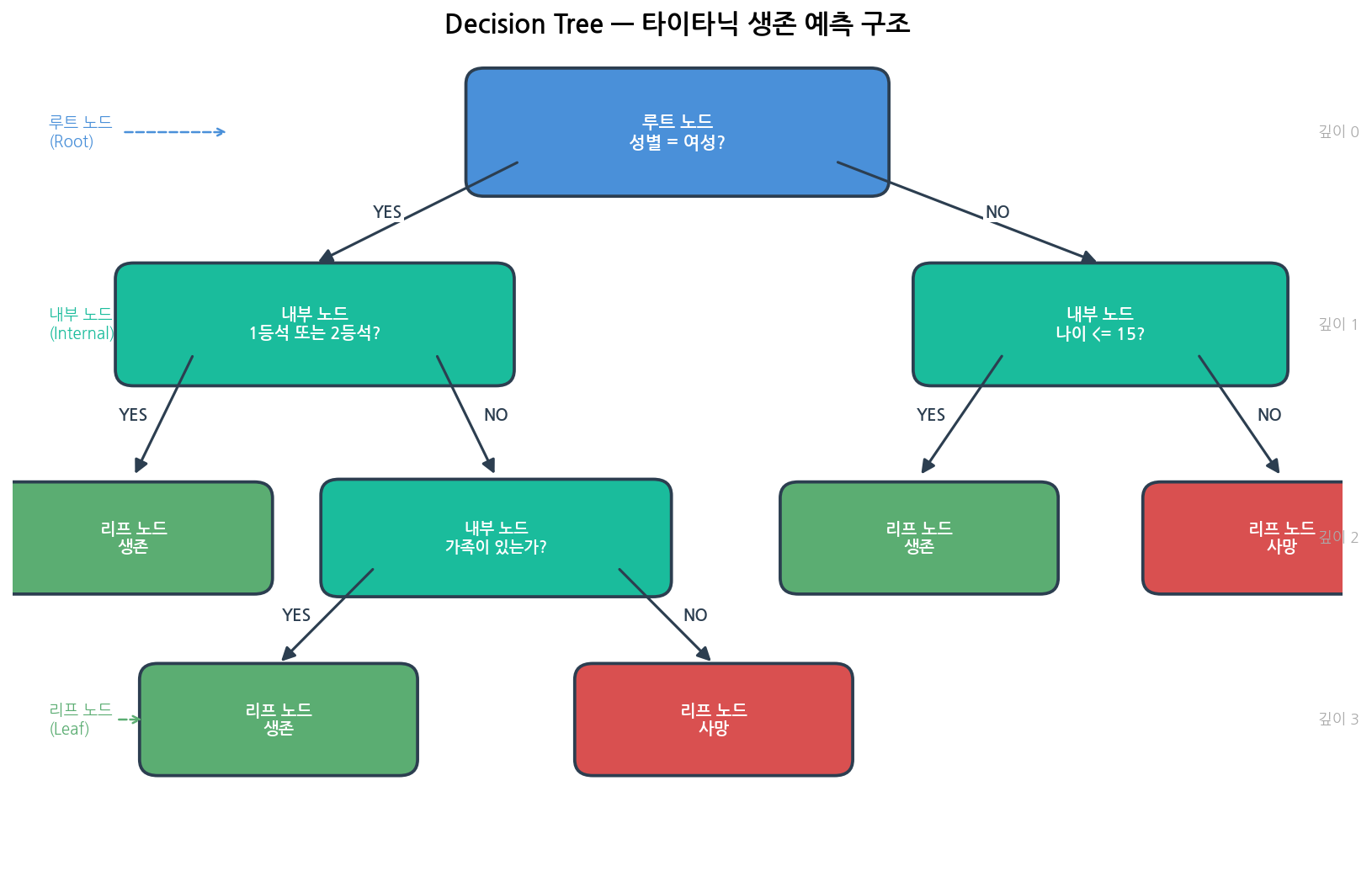
정답: 타이타닉 승객이 생존했는가?
Q1. 여성인가?
└── YES → Q2. 1등석 또는 2등석인가?
└── YES → ✅ 생존
└── NO → Q3. 가족이 있는가?
└── YES → ✅ 생존
└── NO → ❌ 사망
└── NO → Q4. 나이가 15세 미만인가?
└── YES → ✅ 생존
└── NO → ❌ 사망
각 질문이 노드(Node), 최종 답이 리프(Leaf) 입니다.
알고리즘은 이 질문의 순서와 기준을 데이터에서 자동으로 찾아냅니다.
3. 실제 예시로 보기 (분류 / 회귀)
예시 1 — 타이타닉 생존 예측 (분류)
1
2
3
4
5
6
7
8
9
10
11
12
13
14
15
16
17
18
19
20
21
22
23
훈련 데이터:
┌────────┬────────┬─────┬──────────┬──────────┐
│ 이름   │ 성별   │ 나이 │ 객실 등급 │ 생존 여부 │
├────────┼────────┼─────┼──────────┼──────────┤
│ Alice  │ 여성   │  29  │   1등석   │    ✅    │
│ Bob    │ 남성   │  31  │   3등석   │    ❌    │
│ Carol  │ 여성   │  45  │   3등석   │    ✅    │
│ Dave   │ 남성   │  12  │   2등석   │    ✅    │
│ Eve    │ 남성   │  38  │   3등석   │    ❌    │
└────────┴────────┴─────┴──────────┴──────────┘

학습된 트리:

              [성별 = 여성?]
             /              \
         [YES]              [NO]
       ✅ 생존          [나이 ≤ 15?]
                        /         \
                    [YES]         [NO]
                  ✅ 생존        ❌ 사망

새 승객: 남성, 12세  →  NO → 나이 ≤ 15? → YES  →  ✅ 생존 예측
새 승객: 남성, 38세  →  NO → 나이 ≤ 15? → NO   →  ❌ 사망 예측
예시 2 — 집값 예측 (회귀)
Decision Tree는 분류뿐 아니라 연속값 예측(회귀) 도 됩니다.
1
2
3
4
5
6
7
8
9
              [전용면적 ≥ 85㎡?]
             /                  \
         [YES]                  [NO]
   [강남구인가?]           [역세권인가?]
    /         \              /        \
[YES]        [NO]        [YES]        [NO]
15억 예측   9억 예측    6억 예측    4억 예측

리프 노드의 값 = 해당 조건을 만족한 훈련 샘플들의 평균값
4. 트리의 구성 요소
| 구성 요소 | 설명 | 비유 |
|---|---|---|
| 루트 노드 (Root) | 첫 번째 질문. 전체 데이터에서 가장 중요한 특성 | 스무고개의 첫 질문 |
| 내부 노드 (Internal) | 중간 질문. 조건에 따라 좌/우로 분기 | 스무고개의 중간 질문 |
| 리프 노드 (Leaf) | 최종 답. 클래스(분류) 또는 값(회귀) | 스무고개의 정답 |
| 깊이 (Depth) | 루트에서 리프까지 내려간 단계 수 | 질문 몇 번 했는가 |
| 분기 (Split) | 조건 하나로 데이터를 둘로 나누는 것 | 질문 하나 던지는 것 |
5. 어떻게 “좋은 질문”을 찾는가
트리가 분기할 때 핵심 문제는 “어떤 특성(feature)으로, 어떤 기준으로 나눌까?” 입니다.
5-1. 불순도 (Impurity)
노드 안에 다양한 클래스가 섞여 있을수록 불순도가 높습니다.
1
2
3
[순수한 노드 - 좋음]       [불순한 노드 - 나쁨]
🔴🔴🔴🔴🔴               🔴🔵🔴🔵🔴
 → 모두 같은 클래스         → 뒤섞여 있음
불순도를 낮추는 방향으로 분기 기준을 선택합니다.
5-2. 지니 불순도 (Gini Impurity)
sklearn의 기본값입니다.
\[Gini = 1 - \sum_{k} p_k^2\]- $p_k$ = 노드 안에서 클래스 $k$의 비율
- 0에 가까울수록 순수, 0.5에 가까울수록 불순 (이진 분류 기준)
예시:
1
2
3
4
5
6
7
노드에 10개 샘플: 생존 7명, 사망 3명
p_생존 = 0.7,  p_사망 = 0.3

Gini = 1 - (0.7² + 0.3²)
     = 1 - (0.49 + 0.09)
     = 1 - 0.58
     = 0.42
5-3. 엔트로피 (Entropy)
정보이론에서 온 개념. criterion='entropy'로 사용합니다.
- 0 = 완전히 순수, 1 = 완전히 불순 (이진 분류 기준)
- Gini보다 계산이 느리지만, 균형 잡힌 트리를 만드는 경향이 있음
5-4. 정보 이득 (Information Gain)
분기 전후의 불순도 감소량입니다.
정보 이득이 가장 큰 특성과 기준으로 분기합니다.
왼쪽 그래프는 p 값에 따라 Gini와 Entropy가 어떻게 변하는지를,
오른쪽은 실제 분기 전후의 불순도 변화와 정보 이득 계산 예시를 보여줍니다.
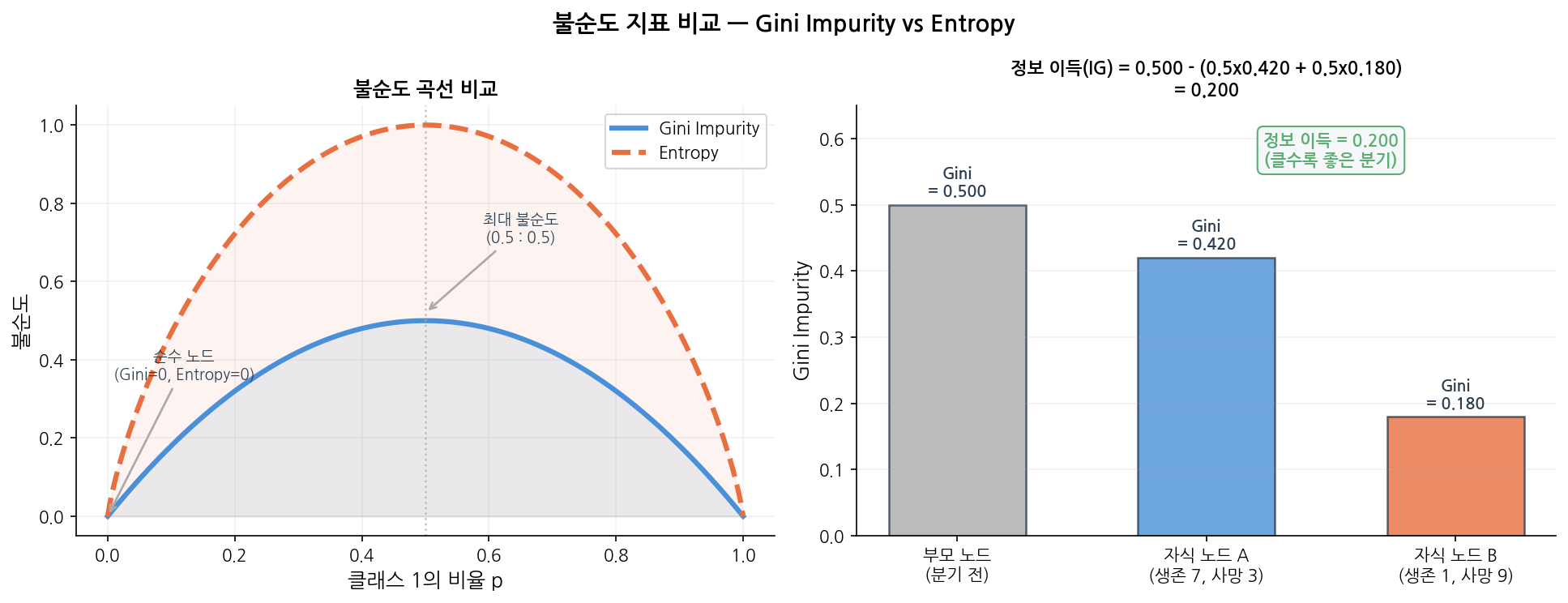
읽는 법:
왼쪽 — 두 곡선 모두 p = 0.5(50 : 50 섞임)일 때 최대, $p = 0$ 또는 $1$(완전 순수)일 때 0.
오른쪽 — 부모 Gini(0.500)에서 자식 평균 Gini(0.300)를 빼면 정보 이득 0.200.
이 값이 클수록 “좋은 분기”이므로, 알고리즘은 모든 특성 중 이 값을 최대화하는 분기를 선택합니다.
6. Decision Tree 장・단점
6-1. ✅ Decision Tree 장점
1
2
3
4
5
6
7
8
9
10
11
12
13
14
1. 결과를 설명해야 할 때
   "왜 이 환자를 고위험으로 분류했나요?"
   → 트리를 보여주면 됩니다

2. 전처리가 어려울 때
   → 스케일링 불필요
   → 이상치에 비교적 강함
   → 결측값이 있어도 어느 정도 동작

3. 비선형 패턴이 있을 때
   → 로지스틱 회귀가 못 잡는 패턴 처리 가능

4. 빠른 프로토타입이 필요할 때
   → 코드 5줄로 동작하는 베이스라인
6-2. ❌ Decision Tree가 약한 상황
1
2
3
4
5
6
7
8
1. 데이터가 적을 때
   → 깊은 트리는 훈련 데이터를 통째로 외움 (과적합)

2. 높은 정확도가 필요할 때
   → 단일 트리의 성능은 Random Forest, XGBoost보다 낮음

3. 연속적인 경계가 필요할 때
   → 직각 경계만 그릴 수 있어 곡선 패턴에 불리
6-2-1. 과적합 (Overfitting) 문제
Decision Tree의 가장 큰 약점입니다.
max_depth=None (제한 없음)일 때:
훈련 정확도 → 100%에 가까움 ← 훈련 데이터를 통째로 외움
테스트 정확도 → 낮음 ← 새 데이터에선 맥을 못 춤
해결책 :
1
2
3
4
5
6
7
8
9
10
11
12
13
14
15
16
17
18
19
20
# 방법 1: max_depth 제한
DT = DecisionTreeClassifier(max_depth = 5, random_state = 0)
# 방법 2: 리프 노드 최소 샘플 수 지정
DT = DecisionTreeClassifier(min_samples_leaf = 10, random_state = 0)
# 방법 3: GridSearchCV로 최적값 탐색
from sklearn.model_selection import GridSearchCV
param_grid = {
'max_depth': [3, 4, 5, 6, 8, None],
'min_samples_leaf': [1, 5, 10, 20]
}
dt_cv = GridSearchCV(
DecisionTreeClassifier(random_state = 0),
param_grid,
cv = 5,
scoring = 'roc_auc'
)
dt_cv.fit(X_train, y_train)
max_depth 값에 따라 결정 경계가 어떻게 달라지는지 직접 확인해보세요.
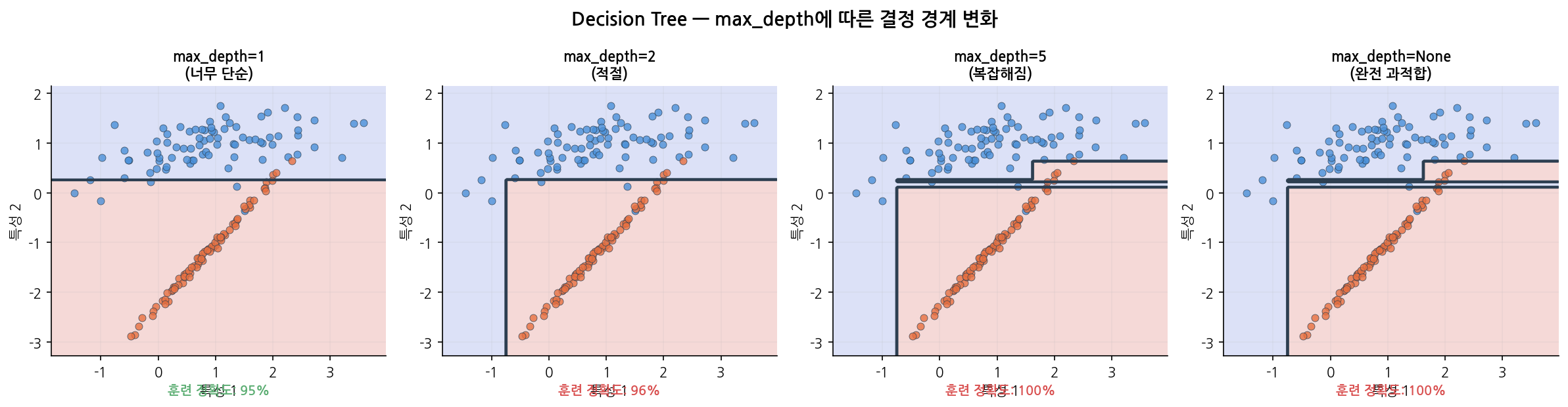
읽는 법:
왼쪽에서 오른쪽으로 갈수록 트리가 깊어집니다.
max_depth = 1은 경계선 하나로 너무 단순하고,max_depth = None은 훈련 데이터를 통째로 외워
경계가 지나치게 복잡합니다.max_depth = 2정도에서 훈련/테스트 균형이 가장 좋습니다.
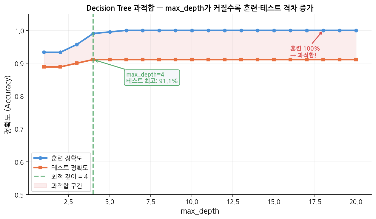
읽는 법:
파란선(훈련)은 max_depth가 커질수록 100%에 수렴하지만,
주황선(테스트)은max_depth = 4근처에서 정점을 찍고 더 이상 오르지 않습니다.
두 선이 벌어지기 시작하는 지점이 과적합의 시작점입니다.
분홍 음영 구간이 과적합 구간 — 이 영역의max_depth는 피해야 합니다.
7. 한눈에 요약
| 항목 | 내용 |
|---|---|
| 알고리즘 유형 | 지도학습 / 분류 & 회귀 모두 가능 |
| 핵심 아이디어 | 정보 이득이 최대인 특성으로 반복 분기 |
| 분기 기준 | Gini Impurity (기본) 또는 Entropy |
| 핵심 파라미터 | max_depth, min_samples_leaf |
| 스케일링 필요? | ❌ 불필요 |
| 해석 가능성 | ✅ 매우 높음 — plot_tree()로 시각화 |
| 과적합 위험 | ⚠️ 높음 — 반드시 깊이 제한 필요 |
| 실전 사용 | 단독보다 Random Forest / GBM의 기반으로 이해 |
8. 다른 알고리즘과 무엇이 다른가
로지스틱 회귀와 비교
1
2
3
4
5
6
7
로지스틱 회귀:
"성별×0.8 + 나이×(-0.02) + 등급×(-0.4) > 0.5  →  생존"
→ 숫자의 조합. 해석하려면 계수를 읽어야 함.

Decision Tree:
"여성이고, 1등석이면  →  생존"
→ 조건의 나열. 누구나 따라갈 수 있음.
선형 vs 비선형 경계
1
2
3
4
5
6
7
8
9
10
로지스틱 회귀 (선형 경계):    Decision Tree (비선형 경계):

나이                            나이
 │  ○ ○ ● ● ●                  │  ○ ○ │ ● ● ●
 │ ○ ○ ● ● ●                   │  ○ ○ │ ● ● ●
 │○ / ● ● ●                    │──────┼──────
 │ / ○ ● ●                     │  ○ ● │ ● ●
 └────────── 소득               │  ○ ○ │ ● ●
  직선 하나로만 구분              └────────── 소득
                                  직각선으로 구분 가능
Decision Tree는 직각 경계(axis-aligned boundary) 를 만듭니다.
곡선은 그릴 수 없지만, 충분한 깊이면 복잡한 패턴도 근사할 수 있습니다.
Decision Tree는 직각 경계(axis-aligned boundary) 를 만듭니다. 곡선은 그릴 수 없지만, 충분한 깊이면 복잡한 패턴도 근사할 수 있습니다.
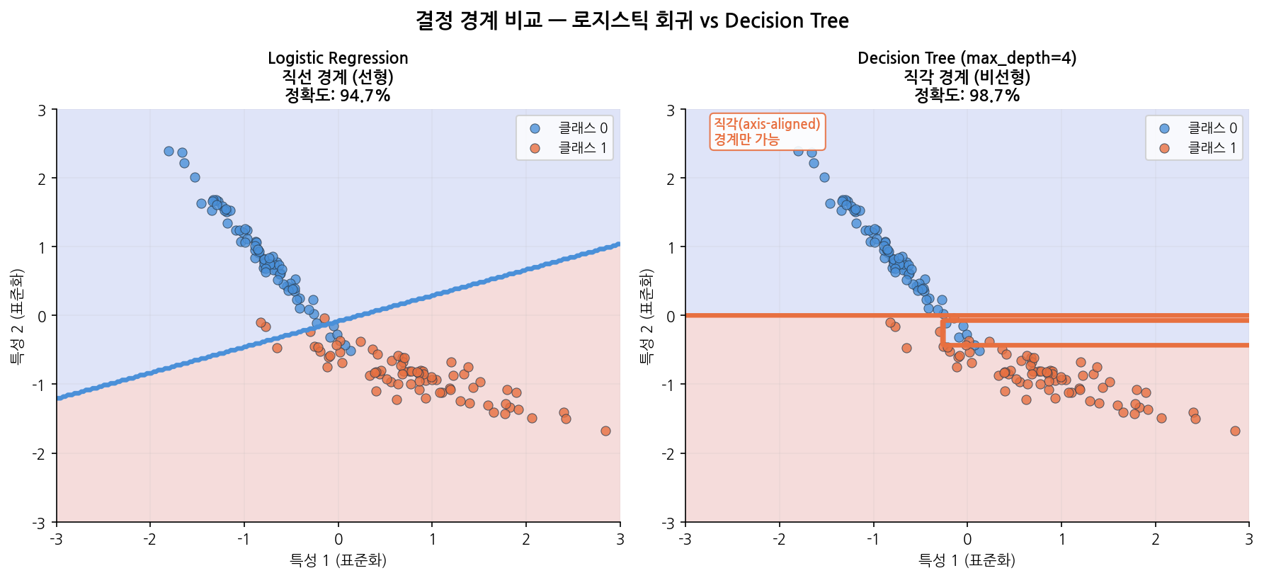
읽는 법:
왼쪽 로지스틱 회귀는 하나의 직선으로 두 클래스를 나눕니다.
오른쪽 Decision Tree는 수직·수평선의 조합으로 계단 모양 경계를 만듭니다.
이 데이터처럼 경계가 대각선에 가까울 때는 직각 경계가 불리하지만,
경계가 수직/수평에 가까운 데이터에서는 Decision Tree가 더 유리합니다.
9. 코드로 보기 — 타이타닉 생존 예측
1
2
3
4
5
6
7
8
9
10
11
12
13
from sklearn.tree import DecisionTreeClassifier
DT = DecisionTreeClassifier(
criterion = 'gini', # 분기 기준: 'gini' (기본) 또는 'entropy'
max_depth = 5, # 트리 최대 깊이 — 가장 중요한 과적합 제어 파라미터
min_samples_split = 10, # 노드를 분기하려면 최소 몇 개의 샘플이 필요한가
min_samples_leaf = 5, # 리프 노드에 최소 몇 개의 샘플이 있어야 하는가
random_state = 0
)
DT.fit(X_train, y_train)
---
| Parameter | Default | 역할 | 과적합 방향 |
|---|---|---|---|
max_depth | None (무제한) | 트리 깊이 제한 | 클수록 과적합 ↑ |
min_samples_split | 2 | 분기에 필요한 최소 샘플 수 | 작을수록 과적합 ↑ |
min_samples_leaf | 1 | 리프에 필요한 최소 샘플 수 | 작을수록 과적합 ↑ |
criterion | 'gini' | 분기 기준 (gini / entropy) | 큰 차이 없음 |
max_features | None | 분기 시 고려할 특성 수 | 적을수록 과적합 ↓ |
max_depth: 트리의 최대 깊이를 제한하는 파라미터- 값 변화별 효과
- 클수록 → 복잡한 패턴 학습, 과적합 ↑
- 작을수록 → 단순한 모델, 과적합 ↓
None이면 모든 Leaf가 순수해질 때까지 분할 → 과적합 위험
- 값 변화별 효과
min_samples_split: 노드를 분할하기 위해 필요한 최소 샘플 수- 값 변화별 효과
- 클수록 → 분할 덜함 → 모델 단순 → 과적합 ↓
- 작을수록 → 계속 분할 → 모델 복잡 → 과적합 ↑
- Options
int: 최소 샘플 개수float: 전체 데이터 대비 비율
- 값 변화별 효과
min_samples_leaf: Leaf 노드에 있어야 하는 최소 샘플 수- 값 변화별 효과
- 클수록 → Leaf가 커짐 → 부드러운 모델 → 과적합 ↓
- 작을수록 → Leaf가 작아짐 → 복잡한 모델 → 과적합 ↑
- 값 변화별 효과
max_features: 각 노드 분할 시 고려할 변수 수- 값 변화별 효과
- 클수록 → 더 좋은 분할 탐색, 트리 간 유사도 ↑
- 작을수록 → 빠른 학습, 트리 다양성 ↑
None이면 전체 변수 사용
- 값 변화별 효과
criterion: 분할 기준
1
2
3
4
5
6
7
8
9
10
11
12
13
14
15
16
17
18
19
20
import pandas as pd
from sklearn.model_selection import train_test_split
from sklearn.preprocessing import StandardScaler
titanic = pd.read_csv('./Data/Titanic.csv')
titanic['FamSize'] = titanic['SibSp'] + titanic['Parch']
use_cols = ['Survived', 'Pclass', 'Sex', 'Age', 'FamSize', 'Fare', 'Embarked']
titanic = titanic[use_cols].dropna(subset = ['Age'])
titanic['Age'] = titanic['Age'].astype(int)
titanic = pd.get_dummies(titanic, columns = ['Pclass', 'Sex', 'Embarked'], drop_first = True)
y = titanic['Survived']
X = titanic.drop('Survived', axis = 1)
X_train, X_test, y_train, y_test = train_test_split(X, y, test_size = 0.25, random_state = 0)
# ⚠️ Decision Tree는 스케일링 불필요 (거리 기반이 아님)
# StandardScaler 생략
> **Note:** Decision Tree는 특성 스케일에 영향을 받지 않습니다. Logistic Regression, SVM, KNN과 달리 `StandardScaler`가 필요 없습니다.
9-2. 모델 학습
1
2
3
4
5
6
7
8
9
from sklearn.tree import DecisionTreeClassifier
DT = DecisionTreeClassifier(
criterion = 'gini', # 분기 기준: 'gini' (기본) 또는 'entropy'
max_depth = 5, # 트리 최대 깊이 — 가장 중요한 과적합 제어 파라미터
min_samples_split = 10, # 노드를 분기하려면 최소 몇 개의 샘플이 필요한가
min_samples_leaf = 5, # 리프 노드에 최소 몇 개의 샘플이 있어야 하는가
random_state = 0
)
9-3. 평가
1
2
3
4
5
6
7
8
9
10
11
12
13
14
15
16
17
18
19
20
from sklearn.metrics import (
accuracy_score, confusion_matrix,
classification_report, roc_auc_score, RocCurveDisplay
)
import matplotlib.pyplot as plt
pred = DT.predict(X_test)
pred_prob = DT.predict_proba(X_test)[:, 1]
cfx = confusion_matrix(y_test, pred)
sensitivity = cfx[1, 1] / (cfx[1, 0] + cfx[1, 1])
specificity = cfx[0, 0] / (cfx[0, 0] + cfx[0, 1])
roc_auc = roc_auc_score(y_test, pred_prob)
print(f"Accuracy : {accuracy_score(y_test, pred) * 100:.2f}%")
print(f"Sensitivity : {sensitivity * 100:.2f}%")
print(f"Specificity : {specificity * 100:.2f}%")
print(f"ROC AUC : {roc_auc:.4f}")
print()
print(classification_report(y_test, pred, target_names = ['Died (0)', 'Survived (1)']))
1
2
3
4
5
6
7
8
9
10
11
12
13
Accuracy    : 80.45%
Sensitivity : 71.05%
Specificity : 87.38%
ROC AUC     : 0.8599

              precision    recall  f1-score   support

    Died (0)       0.80      0.87      0.84       103
Survived (1)       0.81      0.71      0.76        76

    accuracy                           0.80       179
   macro avg       0.80      0.79      0.80       179
weighted avg       0.80      0.80      0.80       179
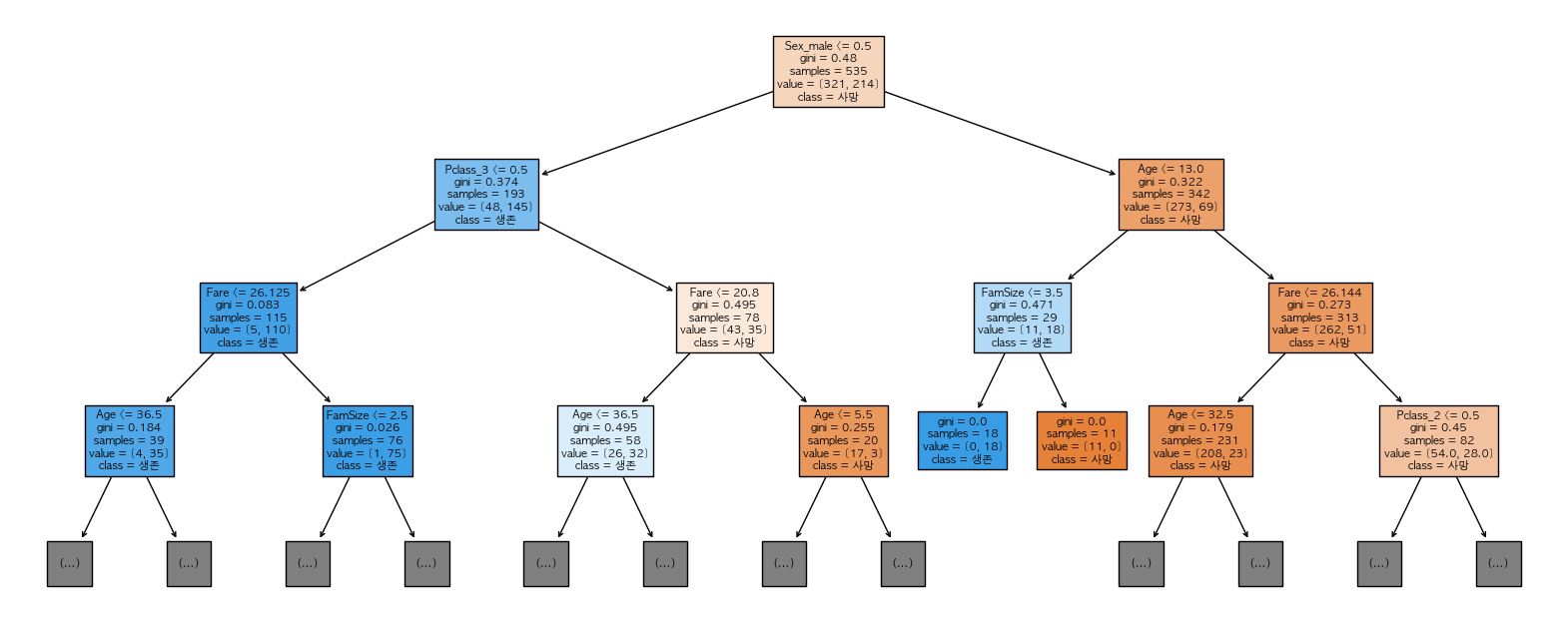
9-4. 트리 시각화
1
2
3
4
5
6
7
8
9
10
11
12
13
14
15
from sklearn.tree import plot_tree
plt.figure(figsize=(20, 8))
plot_tree(
DT,
feature_names = X.columns.tolist(),
class_names = ['Died', 'Survived'],
filled = True, # 클래스별 색상 채우기
rounded = True,
max_depth = 3, # 너무 크면 안 보임 — 상위 3단계만 표시
fontsize = 10
)
plt.title('Decision Tree — Titanic Survival')
plt.tight_layout()
plt.show()
이 시각화가 Decision Tree의 핵심입니다. “왜 이 예측을 했는가”를 그림으로 설명할 수 있는 거의 유일한 ML 알고리즘입니다.
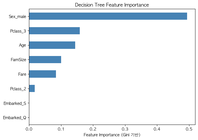
9-6. 특성 중요도
1
2
3
4
5
6
7
8
9
10
11
12
import pandas as pd
import matplotlib.pyplot as plt
importances = pd.Series(DT.feature_importances_, index = X.columns)
importances = importances.sort_values(ascending = True)
plt.figure(figsize = (7, 5))
importances.plot(kind='barh', color = 'steelblue')
plt.xlabel('Feature Importance (Gini 기반)')
plt.title('Decision Tree Feature Importance')
plt.tight_layout()
plt.show()